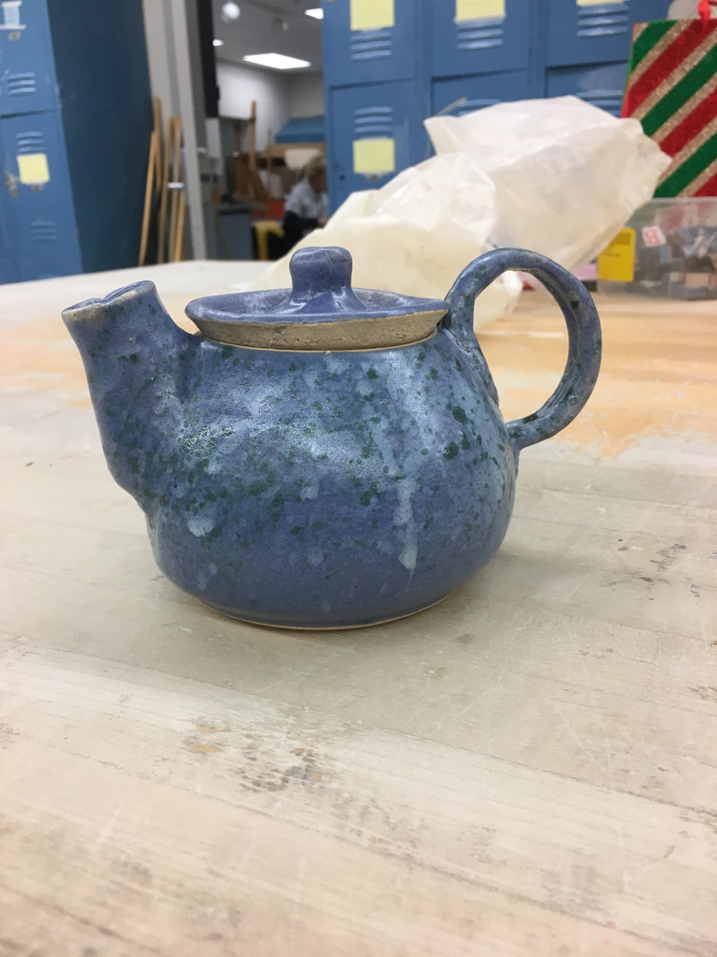
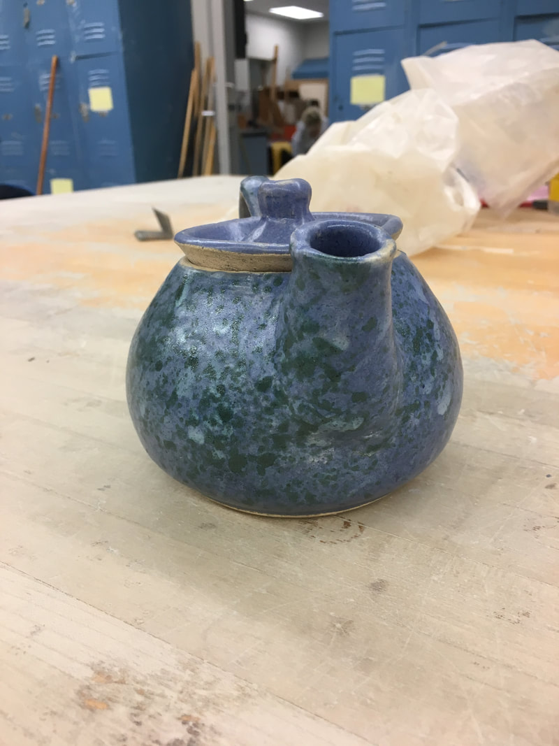
  For my multi-wheel project I made a teapot. My teapot is a short and round shape with a very wide but thin handle. In order to make this project I had to learn how to make and shape a cylinder small enough for the spout which was very challenging working with such a small amount of clay. The wide, rounded handle creates a sense of harmony with the wideness and roundness of the pot itself. By splattering glaze onto the base blue color it created a sense of texture to an otherwise plain and smooth surface. The mixture of blues and greens gives the project a beachy, oceanic feel.
0 Comments
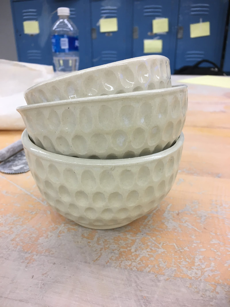 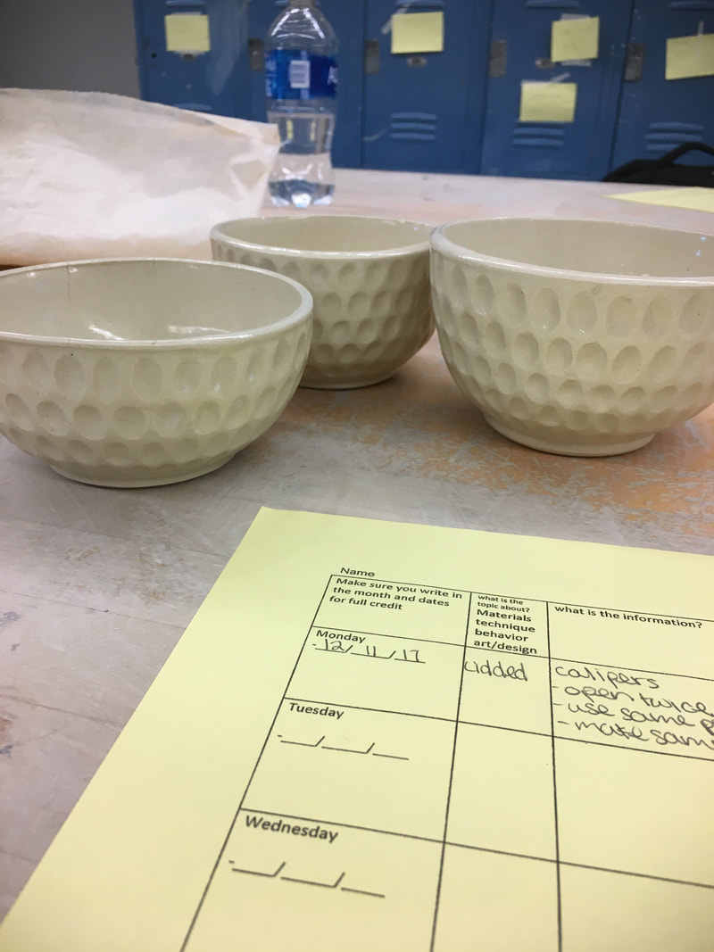 For my set of 3 I made 3 bowls of 3 different sizes, one large, one medium and one small. To make these bowls I practiced using a rib tool to widen out a cylinder into a bowl. These bowls have a lot of texture due to the ovals I carved out of them in a linear pattern. The way that all the carvings are the same size and in a line creates a pattern. Because I created the same pattern on each bowl it creates a sense of harmony between all 3 of them. The pattern on the bowls is very complex and busy so I decided to use a simple white glaze as to not distract from that texture. The white color of the bowls creates a very simple, but elegant feel to the set of bowls.
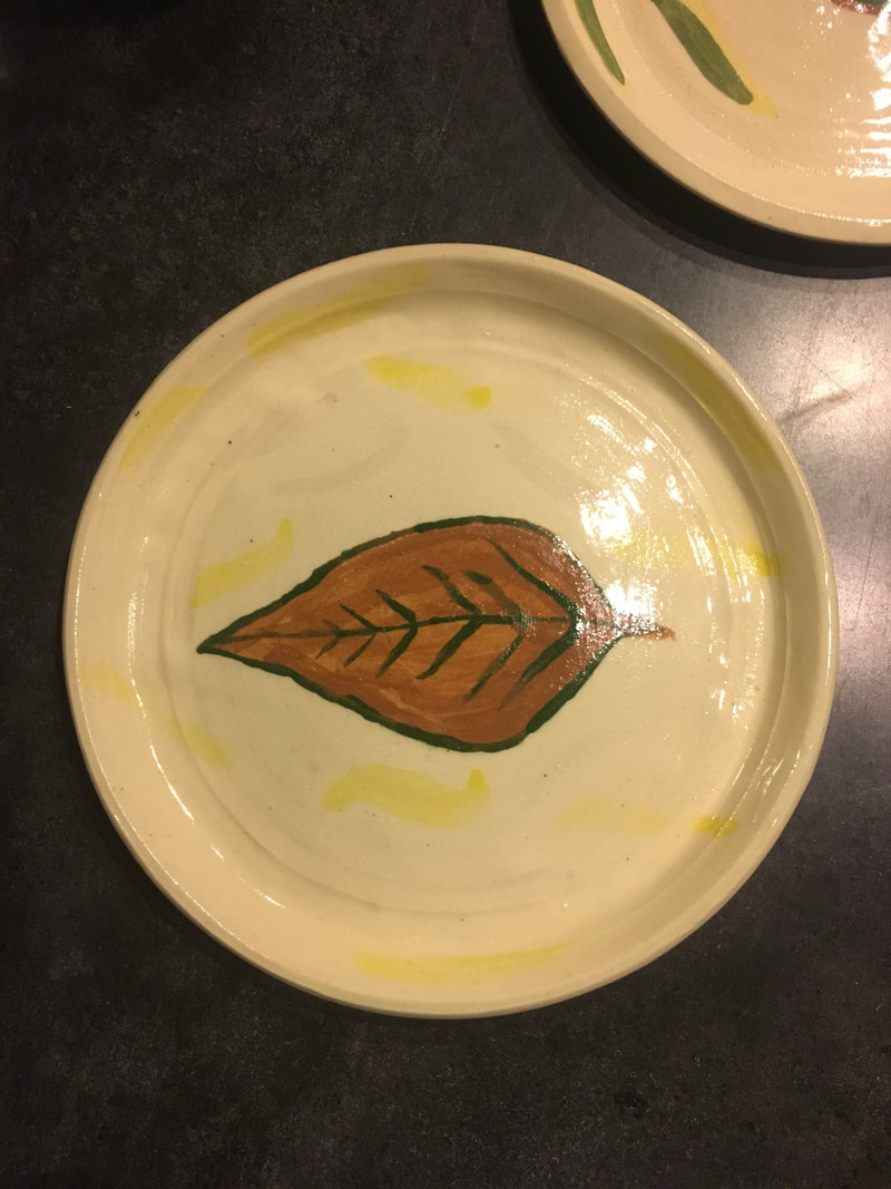 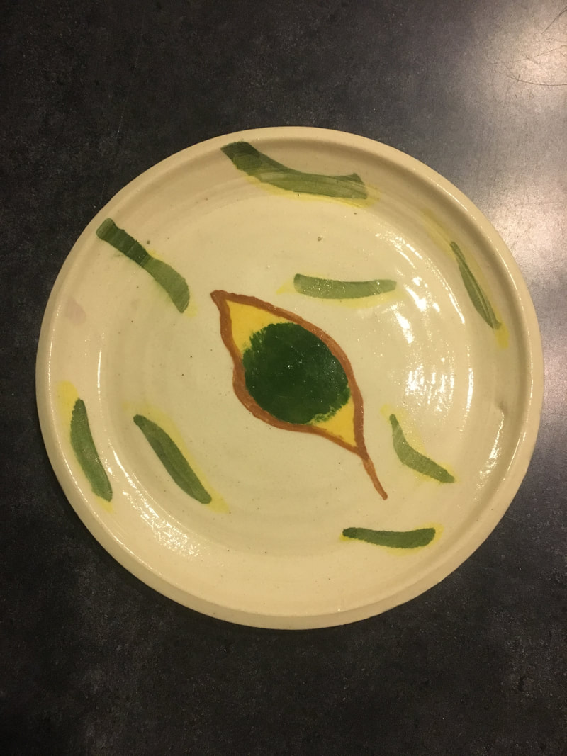 These are my two plates, one of which is about 4 inches wide and the other about 5 inches wide. To make these plates I had to practice forming a project on the wheel without pulling the walls. I also practiced using the foam bat to foot. Because the plates are pretty simple I made a more detailed design on them. I painted leaves in the middle and used watercolor glaze to create streaks representing fall winds around them. The glaze work being similar on both the plates creates a sense of unity between them. Also, the watercolor lines around the leaves create a sense of movement on the project. The leaves and colors of the glazes I use create a very fall feel.
 My team for making the Franken Pot was Jesiah and Emily. I made the base, Jesiah made the top and Emily attempted to make the middle but was having a hard time so she just made a coil to go in the middle. I put all the pieces together. It is about 7 inches tall and 2 or 3 inches wide. To make this project I had to practice using the calipers to make sure the pieces would fit together. I also practiced choking to get my piece as tall as I could. The darker value of blue glaze contrasts nicely with the lighter blue glaze creating a nice line where they meet in the middle. The line where the two glazes meet really emphasizes the height of the project. The project has two contrasting moods from the two different colors. The darker side has a late night feel but the lighter side gives off the mood of a bright, blue sky.
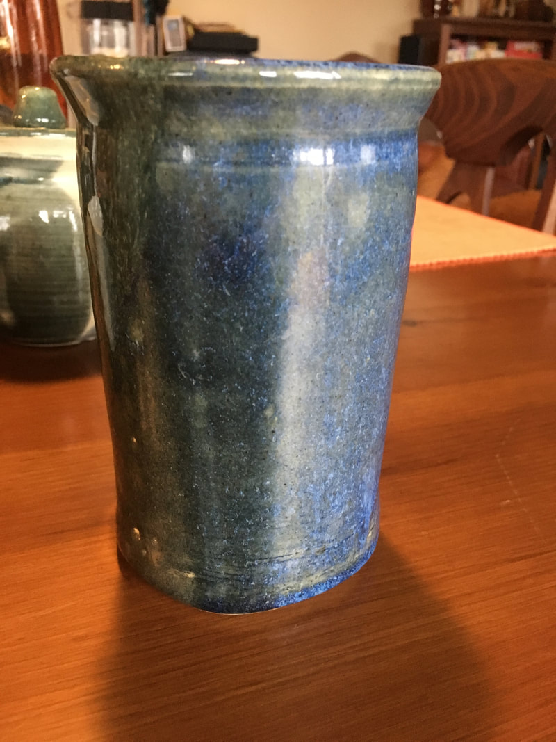
 For extra credit I made a tall vase that widens at the top and has an outreaching lip. To add to the height of this project I had to practice choking. I also focused a lot on keeping my project centered as it got taller. The two different values of glaze create a nice sense of contrast. I made the glaze more "runny" on the lip in order to show the movement. The simple form and complex glaze create a sense of balance. The dark blobs of glaze remind me of dark clouds in the sky and create a sense of gloominess to the project.
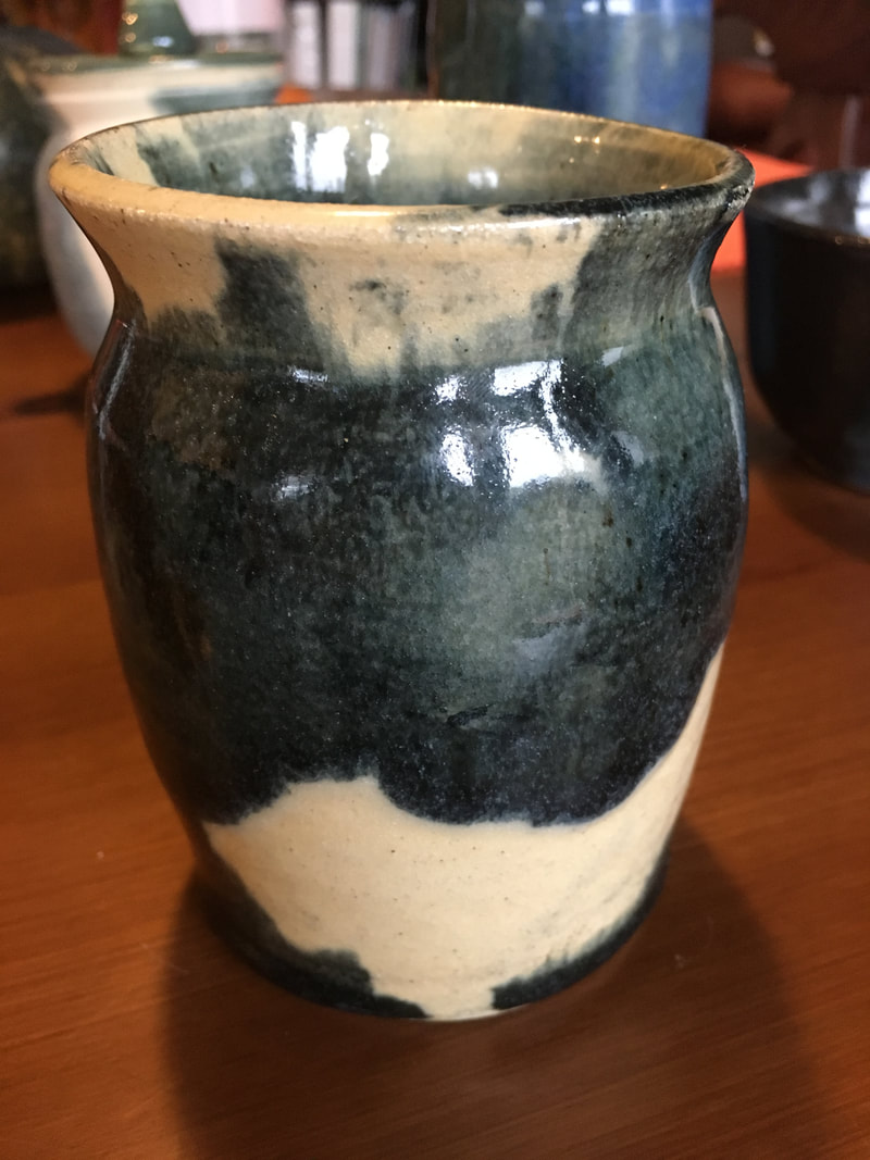
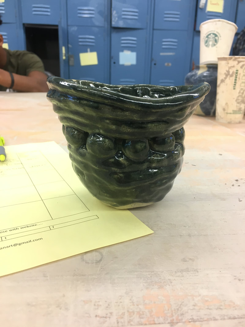
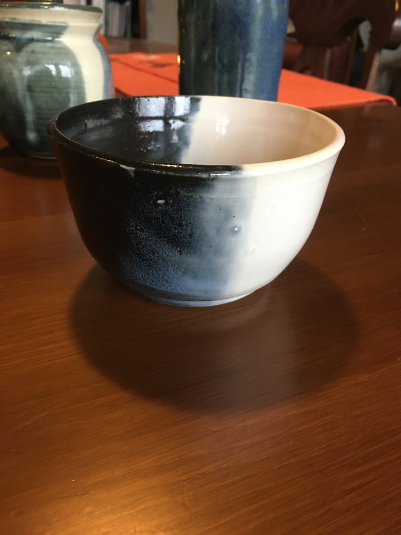 For my choice project I decided to make a bowl that is pretty narrow at the bottom and only begins to really widen at the very top edge, creating a deep bowl. In order to make this bowl I really focused on making sure I was compressing the lip and giving the lip a nice shape at the end. The contrast between the different values of the glazes I used makes the project more interesting. The two different glazes also contrasted in texture as the white fired more smooth and the black came out more rough. Although the two glazes contrast a sense of unity is also created by the blending of the two colors in the middle of the bowl. The darkness of the black side of the bowl gives it a sense of mystery while the white gives it a sense of purity.
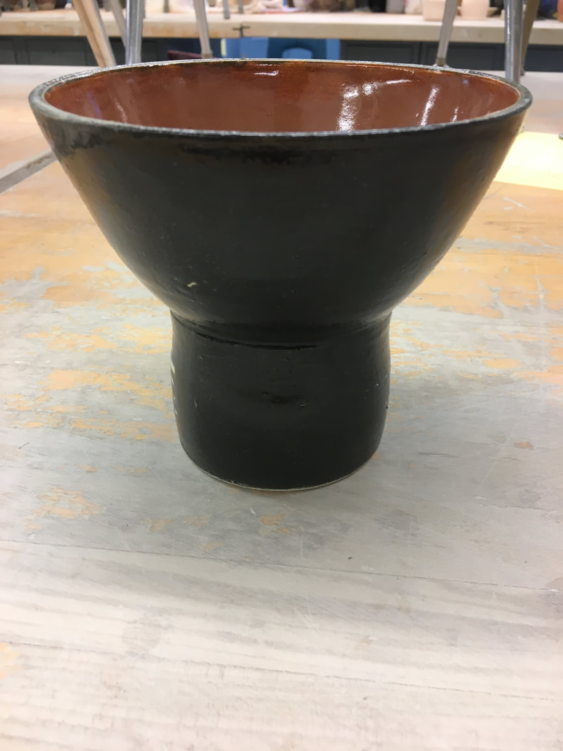 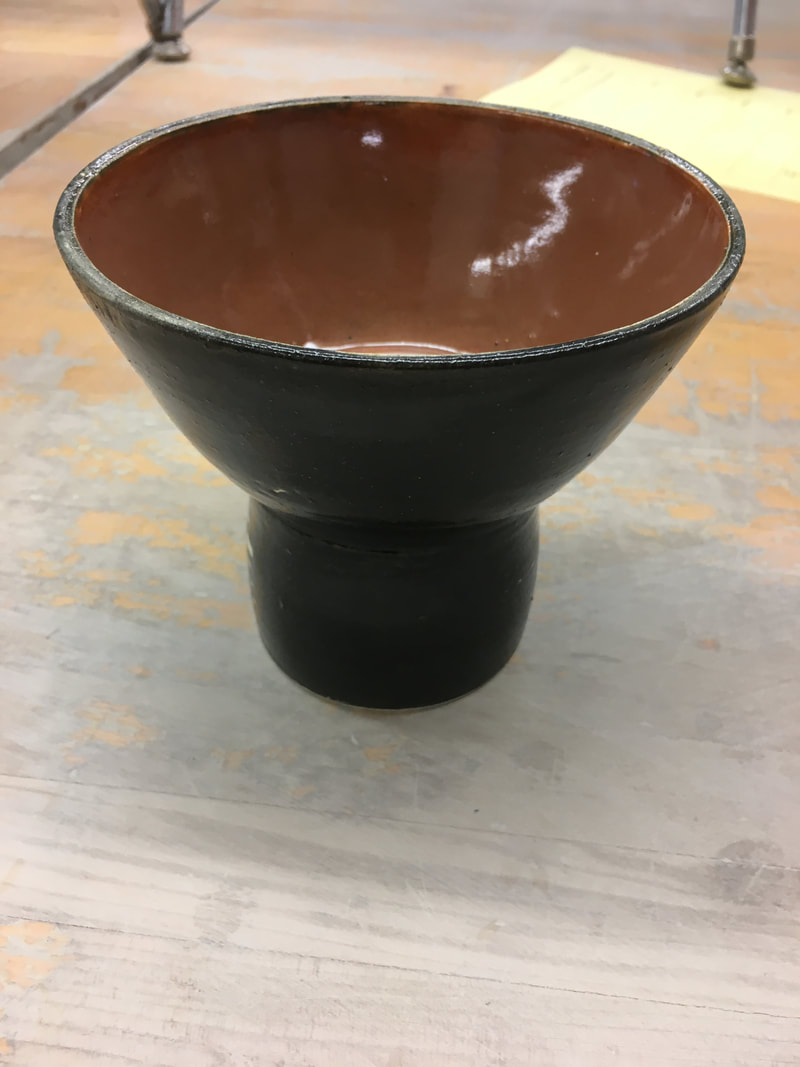 For my pedestal bowl I created a normal sized bowl with fairly tall walls and put it on top of an about 2 1/2 inch cylinder. One skill I had to use in order to make this was slipping and scoring the two pieces together as well as using the calipers to make sure the two pieces fit together. I emphasized the form of the pedestal bowl by using a contrasting color on the inside of the bowl. It was important to make sure the cylinder for the bowl was correctly proportionate to the bowl in order to create a balanced look for the project. The black color on the outside of the project creates a sense of darkness and mystery while the bright orange inside brings a pop of happy color.
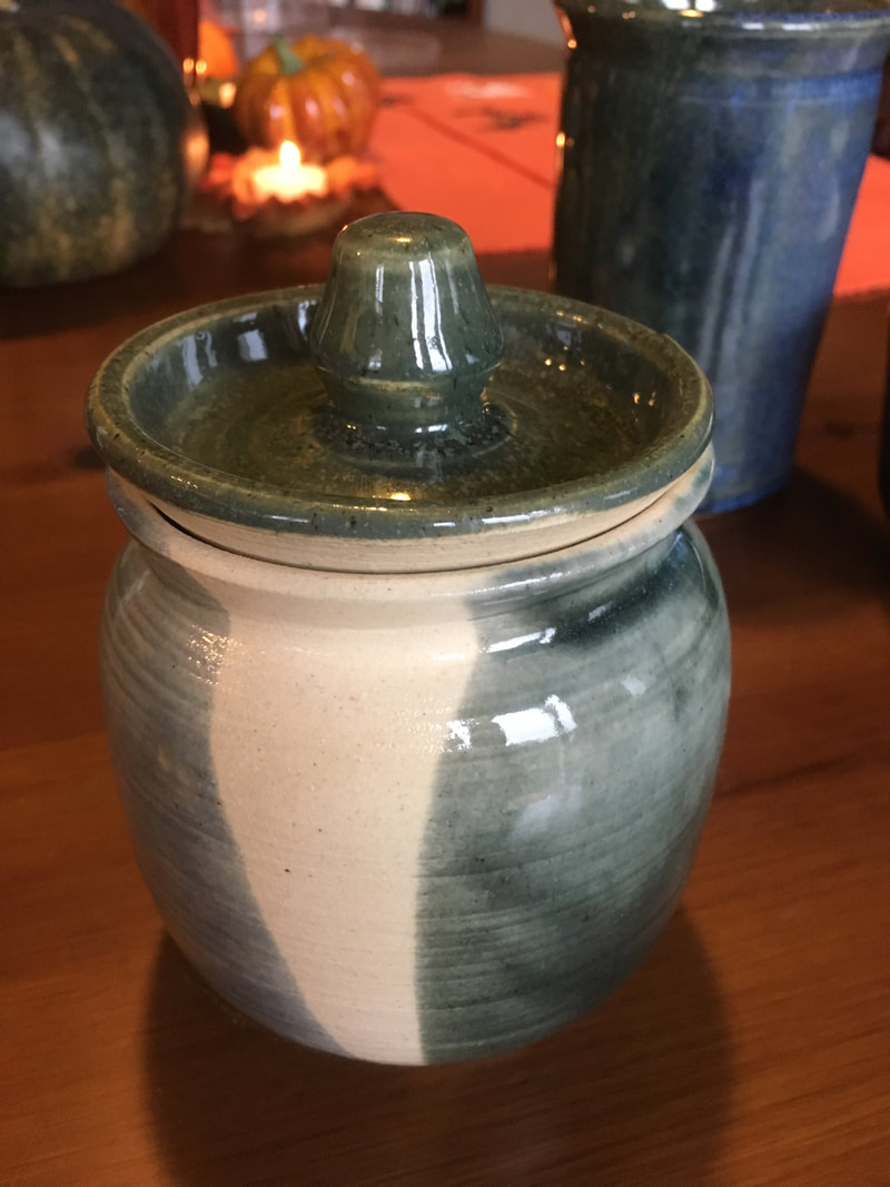 For my lidded project I created a small, fairly simple base with a prominent lip and an inset lid. In order to create a lid that was the correct proportion and fit my project I had to use the calipers to measure. I also had to practice making a nob by opening all the way down to the bat and closing the center back up. Because my project was pretty simple in form I only used one color to glaze it in order to compliment that simplicity. To create a sense of unity between the lid and the base project I used the same glaze on both. The greenish/grey color of the glaze gives the project a natural, yet gloomy feel.
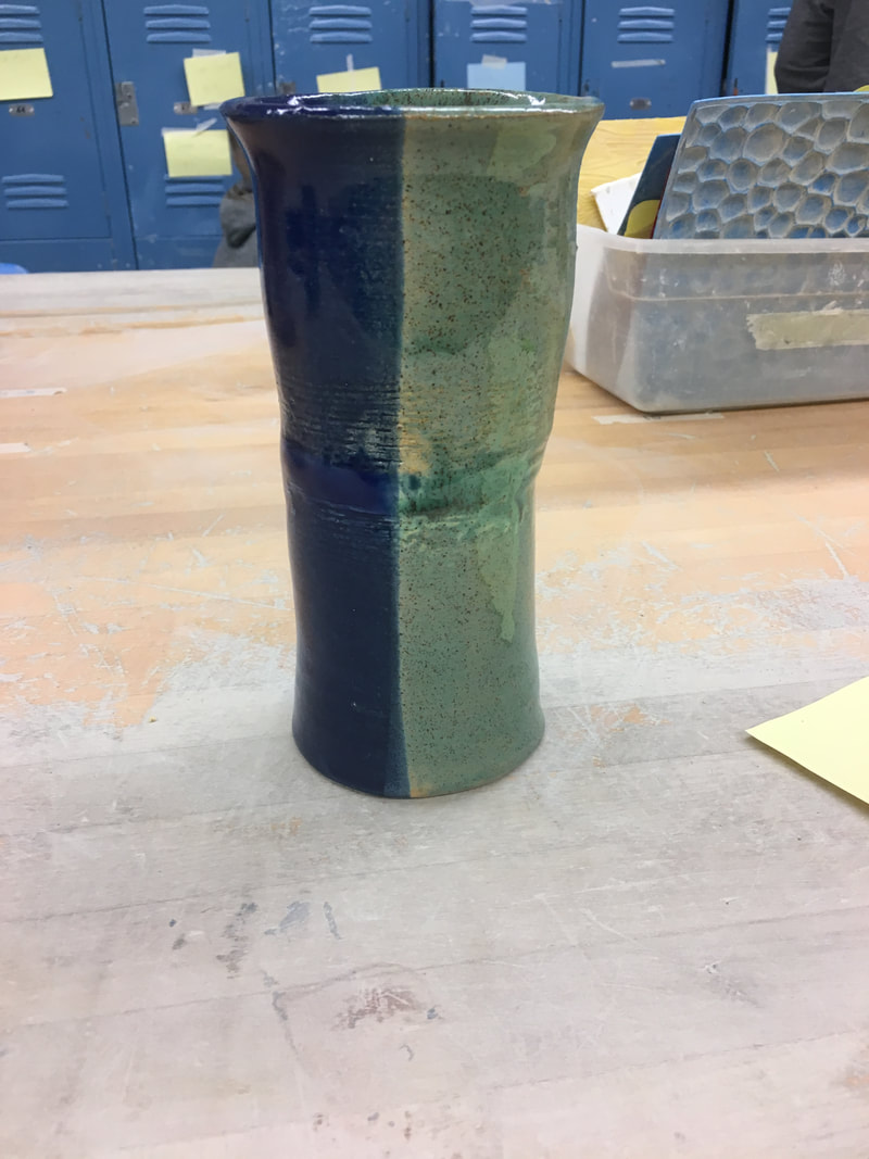
 This is my tall project that is about 5 inches tall and 2-3 inches wide. I attempted this project many times and this was the best I could create, despite the fact that it is not extremely tall. Every time I tried to make this project it would end up getting off centered. I learned that this was happening because the wall was thicker on the top than the bottom, so to create this project successfully I had to practice pulling the wall more carefully, using even pressure throughout the entire pull and going all the way to the top. I also practiced the skill of choking and compressing the lip. The form of this project is fairly simple so to compliment it I used a more complex glaze. I dipped it in multiple different shades of green and blue as well as dripping some white down the sides. While I did use many different glazes they are all very similar in value and together create a sense of harmony. Because the glaze colors I used are all cool tones it creates a very relaxed feel to the project.
 On my team was Jesiah and Emily. We made our coil pot for Gbow. Our coil pot starts with a fairly small base and gets much wider towards the top so that Gbow can fit tennis balls in it. In order to make this coil pot we had to practice rolling out coils from clay and attaching them by slipping and scoring. The dark shade of glaze we used puts an emphasis on our use of negative space in-between coils. Lines created by coils create a sense of movement as it gets wider and wider towards the top. We complemented the complex design of the pot with a simple, single shade glaze. The dark green/blue color gives the pot a sense of mystery.
|
AuthorWrite something about yourself. No need to be fancy, just an overview. Archives
March 2018
Categories |
 RSS Feed
